 |
Institute for Water Quality Studies |
 |
| Paper: The application of geographic information systems to water
quality monitoring Conference: The 5th Scientific Assembly of IAHS, Rabat,
Morocco. MICHAEL SILBERBAUER Institute for Water Quality Studies, Department of Water and Sanitation, Private Bag X313, Pretoria, Gauteng, 0001 South Africa. E-mail: SilberbauerM@dwaf.gov.za Tel.: (international) + 27 12 808 0374; (local) (012) 808 0374 Fax: + 27 12 808 0338 Abstract Much of the responsibility for reporting on surface water quality in South Africa rests with the Institute for Water Quality Studies (IWQS) of the Department of Water and Sanitation. Geographic information systems (GIS) provide a means to summarize large amounts of spatially and temporally distributed data in an intelligible form. GIS developments at IWQS have progressed along two paths, application-specific tools and a general "data mining" system for querying water quality data. Application-specific tools include utilities for cataloguing monitoring stations, checking monitoring frequency and mapping the water quality in village boreholes. The general system, WaterMarque, is a menu-driven front end to a suite of GIS macros and C programs. WaterMarque allows the water quality expert to select monitoring stations interactively and analyse the chemical data. The results are reported symbolically on a map, as box and whisker plots, rose diagrams, ionic diagrams, star symbols time series graphs or icons. PRESENTATION TOOLS
DISCUSSION AND CONCLUSION
Fig. 1 A direct copy of the graphics screen produced by the Barcode
GIS macro
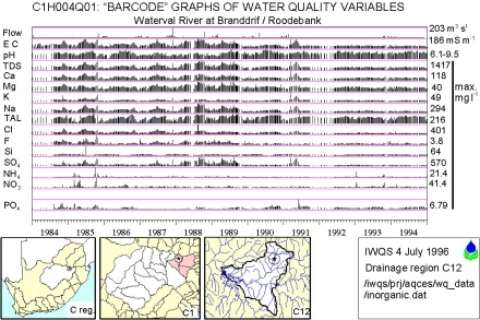
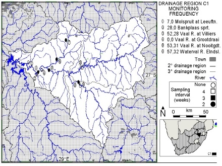
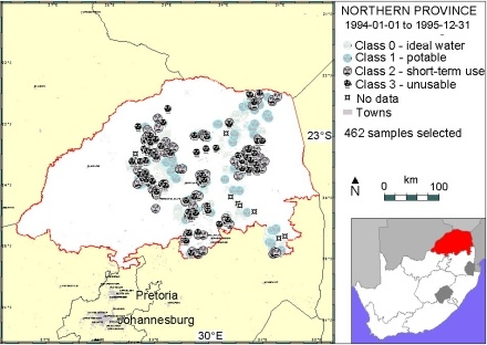
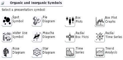
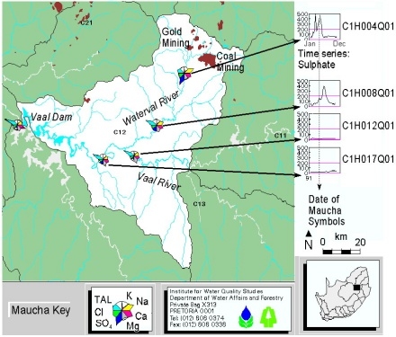
INTRODUCTION Geographic information systems (GIS) have many applications in hydrology that use spatial analytic tools to a greater or lesser extent. In the systems to be described here, the emphasis is on analysis of water quality, and the spatial component serves to place the water quality results in their geographic context. Two approaches were used in system development. The first was to create relatively small, specific, purpose-written applications to solve well-defined problems in the shortest possible time. The second, more ambitious approach was the development of a large suite of menu driven applications that would enable the water quality expert, not skilled in the use of GIS, to do statistical analyses of water quality data and produce maps of the results. WATER QUALITY DATA Most of the water quality data used in these GIS reporting tools is collected by the Department of Water and Sanitation (DWAF) as part of its task of managing the quantity, quality and reliability of South Africa's water resources for the benefit of all users. This task is important enough to be one of the guiding principles of the country's proposed new water law (DWAF, 1996). The Institute for Water Quality Studies (IWQS) is the part of DWAF where water quality analysis and scientific assessment take place. The water quality samples analysed at IWQS come from about 1750 surface monitoring stations around South Africa, at gauging weirs (1200), lakes (450), springs (50), water purification works (35) and canals (15). Many stations are monitored at two-weekly intervals, but some are only monitored intermittently and others are intensively monitored for short periods during specific investigations. The main chemical analysis is for major inorganic ions, while a few samples are tested for trace metals and organic compounds (DWAF, 1992). Results are stored locally on a Laboratory Information Management System (LIMS) and at DWAF head office on part of its mainframe Hydrological Information System (HIS). About 40 000 borehole sample analyses are stored in a separate database. PRESENTATION TOOLS All GIS development at IWQS has been on the Arc/Info system (ESRI, 1991) using versions 6.1.1 and 7.0.4 of the software. Most applications are written in Arc Macro Language (AML). AML macros are interpreted line by line which causes them to be relatively slow, so certain intensive computations are done in routines written in the C programming language. The operating platform consists of three Sun Unix workstations, each with three Arc/Info licences, and six PCs running X-terminal emulation software. An A3 colour printer and an A0 colour plotter are connected to the system. The structure of the network does not yet permit direct AML access to data on the LIMS or HIS, so comma-delimited text files are used for data interchange. Single purpose applications Many single purpose applications have been written at IWQS but the three most used are Barcode, Catchmon and Boreplot. Of the three, Barcode makes the least use of GIS. It is a cataloguing tool that plots a set of water quality time series graphs for each selected monitoring station plus descriptive information and three "postage-stamp" location maps (Fig. 1). The AML parameters, entered on the command line, specify the starting date, ending date and whether to search the database for a single station or all the stations in a specified drainage basin. Catchmon was written to assist in managing the national water quality monitoring network, which is based on a four-tier hierarchical grouping of drainage basins (DWAF, 1993). For each subregion in a selected drainage region, Catchmon maps the positions of monitoring points and lists detailed information about each in a table alongside. It also analyses the sampling frequency in the selected year and the preceding year to determine whether sampling was weekly, fortnightly or monthly, and to detect any changes in monitoring frequency (Fig.2). Boreplot was developed to assist in summarizing the water quality data collected during nationwide drilling of boreholes for drought relief and rural community water supply (Kühn, et al., 1996). The process of sample collection, transport, analysis and data capture used for normal water samples was too slow to supply the information needed by borehole teams, because the results might only be available on the database more than a month after sampling. A more rapid system was developed to handle special borehole samples and the results could be reported within a week. Each sample analysis was compared with a set of criteria against which its suitability for domestic use was judged. To consolidate the borehole information and provide an overview for regional and national management, the Boreplot AML was used to map borehole suitability for each of the nine provinces (Fig. 3). WaterMarque In parallel with the specific type of application described above, the IWQS has developed a menu-driven X-Windows system of AMLs and C routines called WaterMarque (for Water Management, Reporting and Quality Evaluation). The programme consists of three main parts: graphical data selection, data processing and statistics, and map generation (Cobban, 1994; Cobban & Silberbauer, 1993). Graphical data selection. The user is presented with a map of South Africa showing the primary drainage basins. From this the region to be studied is selected. If a small area is required, the selection base can be switched to tertiary drainage basins. The DWAF monitoring points are then displayed and the user proceeds to the data module. Data processing and statistics. Here, the user selects the water quality variables to be displayed, the date range and map symbolization. Twelve map symbol types are available, of which five incorporate some form of time series graph (Fig. 4). Data may be aggregated by mean or percentile. Regular time series data may be subsampled from an irregularly monitored sequence. Various procedures and symbols can be tested on the computer display in combination with a selection of background geographical data such as geology, hydrology and land cover. Map generation. When the user is satisfied with the statistical method and the symbolization, the output process generates a map with title, legend, neatline and graticule. Portrait and landscape aspects are available, and a selection of map sizes from DIN A5 to A0 (149 x 210 mm to 840 x 1188 mm). Figure 5 is a direct print of a screen during a WaterMarque session and illustrates the integration of time series and spatial analysis in tertiary drainage region C12, south east of Johannesburg. Gold and coal mines are located in the upper reaches of the drainage region and any runoff enters the Waterval River. The time series graphs at the right of the image trace the change in sulphate concentration during 1991 at each of the monitoring stations in the drainage region. The Maucha diagrams (Maucha, 1932; Broch & Yake, 1969) at each monitoring point show the instantaneous ionic balance in April 1991. The northernmost monitoring station (C1H004Q01) is closest to the mines and during 1991 the sulphate concentration there exceeded the South African 200 mg l-1 guideline for domestic water quality. Mine drainage only affected the downstream station (C1H008Q01) later in the year. The dilution of sulphate by the larger Vaal River is apparent in the Maucha diagrams for C1H017Q01 and Vaal Dam, which show the ionic composition to be mainly calcium and magnesium bicarbonate. DISCUSSION AND CONCLUSION Single-purpose GIS applications can be developed quickly and adjusted to suit the user's requirements with a minimum of debugging. However, such applications are usually limited to one or a few functions, and each new application requires the full-time attention of a person trained in GIS. GIS training is expensive and it takes years for a person to become fully competent. Multifunction systems like WaterMarque can fulfil a wider range of user requirements. Water quality specialists are able to concentrate on analysing data and presenting their results without detailed knowledge of the platform they are using. The disadvantage of the WaterMarque approach is that developing and maintaining a graphical user interface is a complex task that takes up the bulk of system development time; this limits the time available for developing new analytical and presentation techniques. The ideal is to work with a combination of the two methods, retaining complex procedures in a batch-mode processing environment and building generic procedures into the interactive system. Acknowledgement All development reported in this paper was funded by the South African Department of Water and Sanitation, and the results are published with the permission of the Director-General of the Department. REFERENCES Broch, E. S. & Yake, W. (1969) A modification of Maucha's ionic diagram to include ionic concentrations. Limnol. Oceanogr. 14, 933-935. Cobban, D. A. (1994) Assessment of water quality through a menu-driven user interface on a geographic information system platform. In: Computer Graphics '94 (Proc. 14th Ann. South African Computer Aided Design Symp.), session 1, 1-23. Cobban, D. A. & Silberbauer, M. J. (1993) Water quality decision-making facilitated through the development of an interface between a geographic information system and a water quality database. In: Hydrology in Developing Regions... the Road Ahead (Proc. Sixth South African National Hydrological Symp. ed. by S. A. Lorenz, S. W. Kienzle & M. C. Dent), vol. II, 523-530. DWAF (1992) Analytical Methods Manual. Technical Report 151, Department of Water and Sanitation, Pretoria, South Africa. DWAF (1993) South Africa - Drainage Regions. 1:2 000 000 map. Department of Water and Sanitation, Pretoria. DWAF (1996) Water Law Principles - Discussion Document. Department of Water Affairs and Forestry, Pretoria. ESRI (1991) ARC/INFO Data Model, Concepts & Key Terms. Environmental Systems Research Institute, Inc., Redlands, California, USA. Kühn, A. L., Kempster, P. L. & Everett, A. (1996) Drought Relief Program: An Assessment of the Water Quality of Boreholes for Potable Use, January 1994 to October 1995. IWQS report N/0000/00/GPQ1895, Department of Water and Sanitation, Pretoria. Maucha, R. (1932) Hydrochemische Metoden in der Limnologie (Hydrochemical methods in limnology). Binnengewasser 12, 1-173. Fig. 1 A direct copy of the graphics screen produced by the Barcode GIS macro, which generates a catalogue of monitoring stations with bar graphs of water quality variables. Each "postage stamp" map shows station position at a larger scale. Flow is mean daily discharge, EC is electrical conductivity, TAL is total alkalinity, NH4 and NO3 concentrations are expressed as elemental nitrogen and PO4 as elemental phosphorus. Nitrate includes nitrite. The numbers on the right-hand y-axis indicate the maximum value recorded, except for pH where the range is shown. The annotation has been manually edited for clarity at this reduction. Fig. 2 A copy of the graphics screen produced by the Catchmon GIS macro. Monitoring points are coded according to the rate of sampling, and details of each monitoring point appear in the legend. The two numbers separated by commas are the total samples in the previous year (1990) compared with the total samples in the current year (1991). The normal size of this map is A3 and it has been heavily edited for clarity. Only the first ten points are shown on the map and only the first six of these are listed in the legend. Fig. 3 The graphics screen produced by the Boreplot macro. The samples are plotted in sequence: first the boreholes with ideal water quality, then those of intermediate quality and last those unusable for domestic purposes. The user sees the water sources requiring attention in bright red on the monitor. Boreplot automatically produces a map for each of the nine provinces. The annotation of this screen dump has been edited for clarity. Fig. 4 The graphical organic and inorganic water quality symbols available on the WaterMarque data presentation menu. Fig. 5 The results of a session on WaterMarque. The Maucha diagrams show the ionic composition (meq l-1) of the water at monitoring points in April 1991, while the plots show the changes in sulphate concentration (mg l-1) at each point during 1991. Ten years' data for station C1H004Q01 are summarized in Fig. 1. This screen image has been manually edited for clarity. |
||
