|
Institute for Water Quality Studies |
 |
||||||||||||||||||||||||||||||||||||||||||||||||||||||
DWAF PRESENTATION STANDARDS FOR GIS USERS
4 September 1997
INTRODUCTION INTRODUCTION Freda Jonck, Werner Wolfer and Ralene Potgieter have produced a guide to GIS users at
Head Office on how to present geographic data according to cartographic standards (Presentation
Standards for GIS Users: DWAF, 30 May 1995). Two copies of the guide are available in
the Whale Tank. In addition, Michael Silberbauer has a copy of Symbols and
Abbreviations Used on South African Charts, SAN HO-6, dated 31 March 1995 and
produced by Capt. BH Teuteberg, who is a hydrographer in the SA Navy. ISO 6709 is an example of an
international standard for GIS, i.e. the standard representation of latitude, longitude
and altitude. The purpose of this adaptation of the Head Office standards is to give specific details
relating to water quality mapping and to specify where symbol sets may be found on our
GIS. Certain standards used at Head Office may not be applicable at IWQS, and these will
be highlighted. The idea of these documents is not to be prescriptive but to encourage
uniformity and clarity of style within documents. The person composing a map must carry
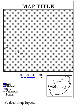
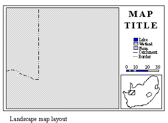
the intended message across to the reader with the minimum of confusion. GENERAL Map layouts can be portrait or landscape. When choosing a layout to be used in a
report, match the map layout to the text layout and be consistent so that the reader does
not have to continually turn the report in order to see figures and text the right way up.
The layouts on pages 2 and 3 of the DWAF Guide were developed specifically for Head Office
applications, and differ slightly from layouts used at IWQS. The most important
differences are the placing of the scale bar, north arrow and logo. The ruled lines for
the data block are not normally used at IWQS. MAP TITLE The map title should be set in large bold text to stand out from other annotation on the map. It should be placed in such a way as not to be confused with other map text. The lettering size can be adjusted to suit the map size and to accommodate long titles.
MAP PLACEMENT The placement of the map should be such that it does not intrude on the frame,
reference, index map and other elements. North / South Orientation On manually compiled maps, the orientation of the map may be adjusted to fit the page. As a general rule, orientation should be north-south with north at the top of the page. If any other orientation is used, remember to include a north arrow.
Identification of Position of Mapped Area There should be enough orientation features to ensure that map readers can see what
area has been mapped. Features which are helpful include towns, roads, railways, rivers,
coastline and borders. Map Extent Information should be shown up to the neatline of the map, except for special cases
such as when the boundary of a catchment is used as the edge of the map. North Arrow and Scale Bar A north arrow should only be used when absolutely necessary. Many of our maps are produced in Albers projection, and at the eastern and western extremes of South Africa they are 'tilted' away from north. The north arrow and scale bar should be placed in the empty space at the lower
right-hand corner of the map sheet. General All features on a map must be explained in the reference. The map reference should be clearly separated from the map. Placement of the Reference Elements Align graphics and type correctly, vertically and horizontally. Group similar items together, e.g. hydrological features, transport lines, land cover types. Leave enough space between symbols to avoid a cluttered appearance. Different types of features should be recognizable as such, e.g. area shading or single lines. Place boxes around area features, but not around point or line features. Avoid using a zigzag symbol for a line feature - a straight line segment is preferred
(this is a problem in ArcView). Logos Place logos in the map reference area. Group multiple logos together. Avoid reducing logos to such an extent that they are indecipherable. Additional Information Include the following information on the map: Date printed - to write the current date and time use: text [quote [date -vmsdate] [date -ampm]] Mapper's name, and optionally the address, phone number, fax, E-mail, etc. (to simplify this operation, place the information in an ASCII file (e.g. address.txt) and write the file with textalignment left textfile address.txt block A reference code, for example the name of a coverage drawn, or the aml that drew it. To automatically write the name of the currently running aml, use text [quote aml$fullfile]. The projection and parameters, e.g. Albers Equal Area, standard parallels 18S and 32S, central meridian 24E, spheroid Clarke1880. The parameters may be read from the prj or prj.adf file in a coverage, or extracted using describe. Information sources (can be logos, see /hri/db/clip). INDEX MAP Separate any index map clearly from the main map. Use sparse labelling, but sufficient for orientation. Use a north arrow (if necessary) and a scale bar. INSET MAPS Inset maps must be oriented in the same direction as the main map. They should conform to the style of the main map. Their position on the main map should be indicated, for example by means of an arrow, box or lines. Their map features must appear in the main map reference. Coordinates Use tics on the map frame or neatline, rather than crosses within the map. Label tics. If you are using the standard Albers projection ( standard parallels 18S
and 32S, central meridian 24E) then inserting the IWQS command chartext near the end of
your aml (after map units and page units have been set) will automatically generate a
neatline and diced, annotated graticule. For Gauss Conform (LO or Transverse) projection,
put the central meridian after the command, e.g. chartext 19. Scale In most cases, a scale bar is essential, but don't write the numerical scale (e.g. 1:50 000) unless you are certain that the map will not be scaled up or down during printing. If a numerical scale is indicated, it should be in the fractional form, e.g. 1:1000 000. Include 'fine tuning' blocks for a section of the scalebar. Use a 'rational' subdivision for the scalebar, for example 5, 10, 15, 20 rather than 12.5, 25, 37.5... The Ultimate Scalebar is a very useful free scalebar AML. If you work in the Department of Water and Sanitation,
a standard aml from Head Office will draw a scale bar with the minimum of fuss: scalebar automatic %bar% %xt% %yt% width %xm% big_blocks 5 small_block 0 bar_text %xm% scale_text no north_arrow no where bar is the length, e.g. in kilometres, xt and yt are the page coordinates where
the bar should appear and xm is the width of the bar. In amls where the map scale is
determined on the fly, the bar length in kilometres needs to be worked out automatically.
The following routine is one way of doing this. Put the line &call
ScaleBarCalc before the scalebar command. North Arrow Use a north arrow consistent in size and style with the rest of the map. Place it above the scale bar and any scale numeral. GENERAL Ensure sufficient contrast between the type and the background. Do this by choosing
appropriate colours, and placing a mask around the text, if necessary: Text should not overlap other information. Use the automatic text placement commands if
necessary, to space text so that it does not overlap: In general, lettering should be written from the left, parallel to the lines of latitude. This is not easy to do with Arc/Info, so simple left-to-right is sufficient. If you are doing a manual layout, place the labels for fixed features and those most difficult to arrange first and fit the others in the remaining space. Writing positioned vertically on the map should read from the lower edge to the upper edge. Text which at any angle than vertical should read from left to right. Avoid placing text at an angle of 45. TEXT SIZE Use a text size which reflects the size of the object being labelled. Text smaller than 1.3mm is illegible. The minimum may be larger for wall maps and
overheads. TEXT FONT, COLOUR AND CASE Be consistent in the use of fonts. Label map features of the same type in the same
font. Do not mix fonts without reason. Adjust fonts to suit the size of the map. Text Colour and Type Use the following guidelines for labelling features: Water features - cursive (italics), cyan (light blue) and with Initial Capitals except ocean names which may be all UPPER-CASE. Towns - non-cursive, black, important towns UPPER-CASE and others with Initial Capitals. Mountains - non-cursive text spaced along the range, black or
brown, UPPER-CASE. TEXT PLACEMENT The text for any feature should either be placed entirely over the land surface being
mapped, or if relevant, over the ocean. Coastal town names should be placed entirely over
the ocean. All text should be placed where it will least obscure underlying information. Fixed Features and Point Features If possible, place the names of point features such as towns to the right of the symbol. The second choice is to the left and the third is 'in close association.' Text should be placed so that the symbol being annotated does not obscure the
lettering. Linear Features As a rule, label linear features such as rivers above the feature in such a way that text is read from left to right. Do not make river names closely follow the curvature of the river, but align them along simple curves. Keep the words of a long description close together, so that the sense is not lost. The labels for long mountain ranges may be shown in spaced type but not so far apart
that the sense is lost. Areal Features If the feature is large enough the label should fall completely within it and be aligned horizontally. An elongated feature that is not horizontal may be labelled parallel to its general orientation. S p a c e d t y p e may be used for large features. Small areal features should be labelled as for point features. Label from west to east along the grid lines, if possible. Annotation for a boundary should be aligned along and within the boundary. Try the command polygonbordertext. GENERAL These are some general rules for map symbols: Area features should be large enough so that the reader can match the colouring or hatching with the reference. Detailed coverages displayed at a small, overview scale may have to be generalised to achieve this. The larger the area being shaded, the lighter the colour (or coarser the hatching) that should be used. Area shading should not obscure linear elements. Likewise, linear elements should be represented in such a way as to stand out against background shading. When generalising map information, keep all mapped features at a similar level of
generalisation. SYMBOLSET FILE ORGANISATION The symbol sets supplied with Arc/Info are available from ArcPlot - simply type a
command such as markerset plotter and that markerset becomes the default. A markerset
called wateruse.mrk developed at IWQS is also available and contains many useful symbols
for mapping water related information. The symbol sets from Head Office described in the
DWAF Guide have been copied to the directory /hri/db/symbol with the following names: hgh.shd - Geological hatched shadeset (hgh.key explains the codes) standard.lin - Head Office linear symbols standard.mrk - Head Office point markers standard.shd - Head Office shade symbols Use commands of the form shadeset /hri/db/symbol/standard to select these sets. Note that Arc/Info uses a dual system for storing markers, and if the correct fonts are
not present, bizarre effects occur. Please see the DWAF Guide for an explanation of the symbol tables and the scales at
which they are used. MAP PROJECTIONS The three most commonly used map projections for southern Africa are listed in the
table below. For convenience, many IWQS maps are drawn in Albers Equal Area projection
with standard parameters (standard parallels 18S and 32S, central meridian 24E, spheroid
Clarke1880). Maps of Lesotho, which were drawn up in Britain, are in the Universal
Transverse Mercator projection.
/hri/db/symbol/wateruse.mrk (click here
for key) The symbols are in repeating groups of four: the first in each set is black with white
masking, the second is red, the third green and the fourth blue. Each symbol is made up of
two or more layers, and many effects can be created with the markerlayer, markercolor and
markerpen commands. The first 208 of these markers were developed at IWQS to represent water users and the
suitability for use of water in the same symbol. Note that the descriptions given in this
key are whimsical, and that you must provide scientifically correct descriptions according
to the type of map and the latest guidelines. Symbols 209 to 220 and 257 to 260 are general-purpose markers. Symbols 221 to 240 are aquatic weeds, also known as undesirable aquatic macrophytes. Symbols 241 to 256 are general-purpose ecosystem status symbols, designed to fit inside
the rectangles 257 to 260. Symbols 265 onwards are general purpose map icons. Further symbols will be added to the set as required. Please submit your requirements to Mike Silberbauer. /hri/db/symbol/hgh.shd
(click here for key) /hri/db/symbol/standard.mrk (click here
for key) The DWAF Guide symbols for use as point markers. Each marker comes in a group of seven
(e.g. 11 to 17 or 461 to 467) ranging from small (1) to large (7) for use at different map
scales as in the table below. Note the borehole and hydrological point symbols.
/hri/db/symbol/standard.lin (click here
for key) /hri/db/symbol/standard.shd
(click here for key) These shade symbols and patterns from the DWAF Guide are grouped in sets of seven, for
use at different scales. Note that shade patterns are notorious for changing colour on
different printers, in bright light or on a colour photocopier. The CSIR and Agricultural Research Council national land cover map uses a different set of symbols to those numbered 714 to 864 here (see /hri/db/cover/s-africa/lcl_250). /hri/db/cover/s-africa/lcl_250.shd
(click here for key) The files /hri/db/cover/s-africa/lcl_250col.key and /hri/db/cover/s-africa/lcl_250hat.key list the codes used in the CSIR/ARC land cover map of South Africa. Please use these in preference to those in standard.shd. |
||||||||||||||||||||||||||||||||||||||||||||||||||||||||