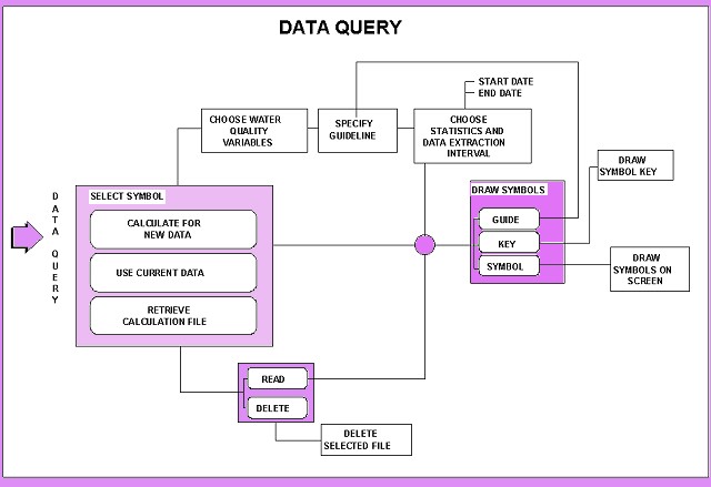
The modules previously discussed are fairly straightforward and explanatory. The Data Query module is more complex. It includes the selection of water quality variables, guidelines, and statistical analysis methods.
Should you have no data subset saved you may still enter the Data Query Module and select the data that you would need in order to produce a map. Should you not save sessions or point selections which you often use, you may never have need of this module as its functionality is incorporated into the Point Selection And Display Module.
The menu to select the symbols for analysis of water quality variables is the Symbols menu, either POLMON or Inorganic. To activate it:
You can also reach it from the point selection and display module. Select a symbol from the Symbols menu, one which best suits your purposes. Click on the icon to the right-hand side of the graph or diagram you want to use.
Eleven options are available for data presentation, roughly divided into two groups:
These different symbols are best used to display different segments or statistics of the recorded data. The symbols to be used must be selected now, as it is essential to know what you want to extract from WaterMarque. Afterwards, as your inquiry deepens, you can go back to this menu and reselect another diagram type for specific purposes. As we shall see, the use of the symbols iterative process. The symbols indicated initially on the Symbols menu are the spot and pie diagrams. These are excellent screening tools enabling you to determine the quality of the data record for each monitoring station.
Spot diagrams display one water quality variable statistically summarised over a user determined period of time. For example, we could display calcium concentrations over a six month period against a certain user defined guideline. The guideline selected may be either the default or a user defined guide.
The diagram appears as a coloured circle on the map at the position of the monitoring station or in a space next to the map, as defined by the user. The colour of the diagram shows the exceedance or compliance of the data to the set guideline.
The size of the diagram depends on the magnitude of the statistic. For example, a monitoring station has records for calcium water quality variables which for 75 per cent of the record exceed the guidelines. It will appear red. Let's say it has in the 75th percentile of the data a reading of 4000 mg/l. Another monitoring station has in the 75th percentile a reading of 400 mg/l. This happens to be well within the required guideline, so it appears on the screen in blue. The first station will appear onscreen as a circle which is ten times the area of the second, because the units measured there at the set statistic exceed that of the second by a factor of ten. The spot areas (not diameters) increase linearly with concentration.
Click on a check box in the select colours menu to display the numerical value of the 75th percentile (i.e. 400 or 4000) on the symbol. You can also display the water quality statistic on top of the spot symbol, if the exact number is of concern to the report.
Pie Diagrams
Pie diagrams display information about one water quality variable over a user determined period of time. The greater the number of records for that water quality variable, the greater in size will be the pie diagram. As such the pie diagrams are essentially a counter mechanism. The colours of the diagram are determined by the exceedance or adherence to a user defined guideline. Pie diagrams differ from the spot symbols in that they are not affected by any selection of statistic.
The slices within the pie indicate what proportion of the data at that monitoring point is in exceedance or compliance with the data. The exceedance and compliance are indicated by the colours of the slices.
The user can decide to display the actual number of data records at a particular station through the Change Colours for Symbols menu. The number will appear on the surface of the pie. The use of this facility is not recommended for output purposes as the number being displayed to screen may obscure the diagram, especially small slices within the diagram.
For a few monitoring stations within a small catchment, pie diagrams are a useful facility.
Water Use Symbols
The Water Use symbols are an IWQS specific markerset, mostly designed to display the exceedance or adherence to user defined guidelines. The symbols are of different colours depending on the position of the statistic chosen, as compared against the guidelines set.
Should you select an industrial or agricultural guideline the symbols will correspond to that selection. For example, a selection of agricultural guidelines produces plant and animal symbols on the screen.
Box Plots
Box plots used in WaterMarque correspond to the standard box and whisker plot used in graphics packages. Box plots display one variable over a user defined period of time. The main body of the Box Plot corresponds to the 25th percentile and the 75th percentile of the data record at that point. The whiskers indicate the position of the 5 th and the 95th percentiles.
The colours displayed within the boxes are user defined and show compliance with the guidelines. For example, if the 30th percentile in the data exceeds the maximum set by the guideline, the box will be shaded red from that point upwards.
Box Plot Graphs
Box Plot Graphs are time-series graphs composed of annual box plots. The graphs display one variable over a number of years. Each box plot displays the data record for that monitoring point over a period of a year. This option allows the user to find trends in the data over a period of years. The data can then be re-evaluated in a time series graph. The relative sizes of the box plots in the graph represent variability in the data.
Radial Box Plot Graphs
Radial box plot graphs display data for one variable over a period of several years. Colours and proportions of the box plots are similar to the box plots discussed above. The resultant diagram is a circular box plot with each year indicated on the diagram. Radial box plots are more compact than ordinary box plot graphs.
Time Series
Time Series Graphs display one variable for a user defined period of time. It is a standard line graph with x and y axes. The x axis represents time and the y axis the water quality variable selected by the user. Guidelines can be displayed as horizontal lines, in a different colour to the rest of the diagram. The use of the diagram can lead to some clutter on the map but it is a useful tool in the analysis of 'raw data'. After initial assessments have been made using this tool, more concise and specific symbols can be used to output the results. Time Series are best displayed in the separate area off the main body of the map, with connecting lines to the monitoring points.
Multiple water quality variable symbols
WaterMarque uses three kinds of multiple water quality variable presentation symbols:
These diagrams are used to display at least two and as many as twelve different water quality variables.
Maucha Diagrams
The Maucha diagram is a very specific symbol designed to display a set number and a set group of water quality variables. It displays three anions and four cations. A proper understanding of this symbol is required before use. The most important feature of the Maucha symbol that differs from the other symbols is the way that it uses the time period selection. The Maucha module takes only the first valid sample in the selected time period for plotting. To ensure that you have data comparable between, monitoring points, therefore, choose a short time interval in the data selection fields.
The Hungarian geochemist, Rezso Maucha, used this symbol in the 1920s and 1930s to summarise the major ions in water. It allows rapid comparison of the major solutes in different water samples. The diagram is ingenious but tedious to construct manually, and consists of an eight-pointed star symbol with the anions (negatively charged ions) on the left and the cations (positively charged ions) on the right. Concentrations are represented in milli-equivalents per litre (meq L -1) so that the balance of cations and anions can be seen at a glance--no stable water sample should have a surplus of positive or negative charge. The background circle shows what a sample would look like with precisely the same number of equivalents for each major ion.
In the 1960s, limnologists modified the symbol so that its
size is proportional to the total dissolved salt (TDS)
concentration. In WaterMarque, the carbonate and bicarbonate ions
have been combined into a single total alkalinity spike, because
of problems distinguishing between the two in a preserved sample.
The Maucha diagram is now a powerful method for summarising TDS
and ionic composition in one symbol. The interpretation of the
symbol is illustrated in the following two diagrams from the Vaal
River: 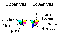
Rose Diagrams
Rose diagrams are used to display more than one water quality variable simultaneously. A minimum of two variables must be selected. Up to twelve water quality variables can be displayed at one time.
A circle represents the guidelines for each water quality variable selected and the data is normalised to the circle. Any exceedances are indicated as red petals.
Star Diagrams
Star diagrams are used to display more than one water quality variable simultaneously. A minimum of two must be selected. Up to twelve water quality variables can be displayed at one time. The star diagram is based on a circle representing the guidelines for each water quality variable selected and the data is normalised to the limit. Any exceedances are indicated as red blades outside the circle.
Using multiple water quality variable symbols
In most scenarios, the water quality variables and the ranges differ. For this reason, the symbols normalise the data to allow for comparative visualisations of different water quality variables on the same symbol.
As a result, neither the absolute values nor any indication of the actual data can be determined from Rose and Star symbols. The size of the blade or petal is not proportional to water constituent concentrations, which is the basis of all the single water quality variable symbols (spot, pie, etc.).
The Maucha symbol represents ionic rather than molar or mg/L concentrations.
Note that the name of your choice now appears beside the current prompt below the presentation symbols, to confirm your choice.
Now you must either choose new data or reuse
data chosen previously.
Always select new data for Maucha symbols!
Click on the Done icon.
If you have chosen to select new data
If you choose to select new data, and you have chosen the Inorganic dataset, the Inorganic Symbols menu will appear.
If you have chosen to use the current data selection option
If chemical datasets and Use Current Data Selection options were selected, then the next menu to appear is the Choose statistic to draw symbol menu discussed in conjunction with the diagram or graph type in the following sections.
If you have chosen to retrieve a calculation file
In certain circumstances you will find it necessary to save your session selections and either:
![]() In order for you
to retrieve saved data it is necessary for you to have previously
saved a session!
In order for you
to retrieve saved data it is necessary for you to have previously
saved a session!
The data saved by the save function comprises the catchment selection, the monitoring point data type and the water quality variables chosen. Click on the appropriate check box.
The Data for symbols menu will appear on screen. The menu consists of: a scrollable list box, a file description and some functionality icons, which are found at the bases of most of the WaterMarque menus.
The scrollable list box contains all the files in the directory to which you have saved such session information. If you have no information saved to these directories, the scroll box appears empty.
Below this you will find the description defining aspects of the saved data such as
Select the file that you wish to work in. You can now choose either to delete the file or read it into your current session.
The file will be removed from the working directories.
Click on the Done icon.
Select water quality variables
To select water quality variables, click on the check boxes of the members of the Water Quality Variables menu. You may wish to select only a few in which case selecting by pointer is most suited.
![]() If you become
involved in an in depth inquiry and wish to investigate the
concentrations of many water quality variables, select them all
now to prevent having to come back later and selecting them.
There is no obligation for you to plot all water quality
variables selected. Select all the water quality variable you
might need now. If you need them all click on the All On
icon. Change your mind or want to clear your present choices,
click on the All Off icon. When satisfied with your
selection, click on the Done icon.
If you become
involved in an in depth inquiry and wish to investigate the
concentrations of many water quality variables, select them all
now to prevent having to come back later and selecting them.
There is no obligation for you to plot all water quality
variables selected. Select all the water quality variable you
might need now. If you need them all click on the All On
icon. Change your mind or want to clear your present choices,
click on the All Off icon. When satisfied with your
selection, click on the Done icon.
Define water quality guidelines
The Define Water Quality Guidelines menu appears.
![]() The water quality
variables that you selected in Inorganic Water Quality
Variables menu, are already listed in this menu.
The water quality
variables that you selected in Inorganic Water Quality
Variables menu, are already listed in this menu.
It is necessary to define the minimum and maximum guidelines for use of these water quality variables. Maximum and minimum concentrations of different variables are the guidelines against which the water monitoring data is compared and assessed. The guidelines are necessary as points of reference. Different standards exist for the five recognised water uses e.g. Domestic.
To select the guideline against which the data will be compared, click on the Guide icon near the upper left-hand corner of the menu (centre the cursor arrow on the Guide icon and press the left mouse button once).
A popup menu called the Guideline selection menu appears with five options:
Click on any one of these options, e.g. agriculture.
A second popup menu now detailing uses within that section appears.
Note that the selection has been listed on this popup menu as
Use 1: Agriculture,
so that you cannot become confused. Further Use labels will
appear should you select aquaculture as an additional class
requiring guidelines.
Click on the appropriate menu item . It will become highlighted. It will also appear next to Use 2: on the Guidelines for water quality menu. Numbers will now start appearing next to the water quality variable listed in that menu.
Had your original choice been industry, your second popup menu would have included industry subsets such as:
Numbers start to appear beside the variables selected in the
Inorganic Water Quality Variables menu, which are already
listed in this menu. ![]()
Note that not all the variables have guidelines for all water uses as some water quality variables are simply irrelevant to some water uses e.g. conductivity in noncontact recreation. You can type in guidelines if you wish to do so.
The second popup menu to determine the water variable guidelines appears.
Now click on the Done icon. The Data Extraction Intervals menu appears.
Define data extraction intervals, statistical analysis and sampling level
Please note that there are three sets of information required on the Data Extraction menu:
Finally click on Done.
Choosing the Statistic
The Choose statistic to draw symbol menu appears. Select the portion of the data that you wish to analyse. If you selected a single water quality variable symbol then you will have to select the water quality variable on this menu. Do this by clicking on the variable you would like to analyse in the scroll box in the middle of the menu.
If you selected a multiple water quality variable then you will simply have to switch on the variables as you wish to display them. To do this, simply click on the check box next to the correct variable.
The statistics that you can choose to display and use to analyse the data are:
You also have the option of a user-defined percentile, created by simply clicking on the insert point before the field and typing in the value.
In the scroll box below the statistic area, choose the water quality variable you wish to analyse. The selected variable will appear in the menu section below this with the guidelines set.
This menu also requires you to select the position of the symbol to be drawn, either at:
![]() WaterMarque can
draw a maximum of 14 symbols in this area.
WaterMarque can
draw a maximum of 14 symbols in this area.
For clarity, you may link the monitoring points to the area to the right of the map where the symbols will be plotted. To link the symbols to the map click on the link symbols to the map check box.
Choosing to draw the symbols to the map or the area to the right of it is one thing you will have to consider. The drawing of symbols to the map may obscure the presentation of the final output. On the other hand, should you choose to select the separate area option you are restricted to displaying 14 symbols. Remember that many of the tertiary catchments may have up to 60 points and you will have to find some way to thin out the population, or, simply keep your symbols with the map.
At this point you may wish to exit your session to work on another aspect of selection or you may wish to end your session on WaterMarque.
For these purposes, this menu has been equipped with a Save icon on the bottom of the menu.
If you elect to save the session, be aware that the information that you are saving is the following:
All the layer information that you would like to display with the stored data must be reselected through the layer availability module.
To plot the selections that you have made, click on the symbol icon. The next menu to appear will be the Choose colours for symbols menu.
General diagram for menus that regulate size, position and colour
of analysis.
Choose Colours for Symbols Menu
This menu allows you to:
To draw a key explaining the diagram to the map user click on the Key icon.
To redefine and reselect your guidelines for a specific water quality variable click on the Guide icon.
To draw click on the Draw icon.